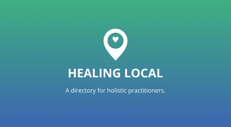
Client: Healing Local, Modern Masters
Platforms: WordPress
Tools: Google Forms, Amazon Mechanical Turk, Figma
Processes: Sketching, User Research, Brand Design
Team: Nathan Nash, Dana Harvey
Link: https://healinglocal.org/
Discovery
Mind Mapping
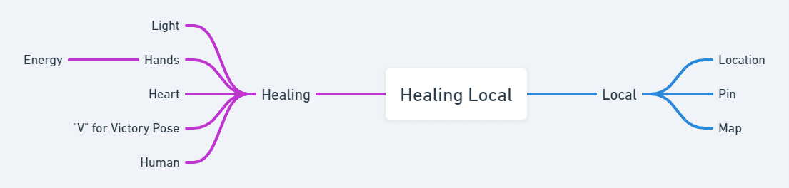
Using Whimsical, I created a mind map to brainstorm different ideas using word associations to create concepts. For example, “light” and “hands” create the concept of hands holding the light. When you search Google Images for the word “healing”, hands holding light is one of the most referenced concepts. This is interesting to me since the idea of energy healing isn’t accepted among Western thinking. Another popular image is the idea of victory over an illness. The image of an individual holding up their arms in the “V for Victory” pose. A universal gesture which is often seen among Olympic athletes.
Define
Sketching

After completing the mind mapping exercise, I grabbed my pencil bag and printed out several pages of dot grid paper. I used the “4-up” sketching method to generate ideas. Once the sketches were done, I imported the images into Figma to create digital versions. Then, I sent the digital logos over to the client for feedback. Out of all four options, the clients preferred the first one and asked for another variation for comparison so I drew up another logo.
User Preference Test


With the digitized logos in tow, I conducted a preference test to see which logo the general public preferred. I created a survey using Google Forms to collect responses and Amazon Mechanical Turk to recruit a panel of 55 participants. The survey itself was simple. I showed the participants each logo, asked them to select their favorite, and then had them write an explanation of their choice.
Before conducting the user preference test, I requested feedback on the logos from the client and they stated that they liked Option A the most.
Of the 55 participants, 67.3% (37) preferred option B, while only 32.7% (18) preferred option A.
Here are some of the survey participants reactions to option B.
“It looks more unique. The other one is bland.”
“It’s more aesthetically pleasing, and more professional.”
“Seems more modern and action oriented.”
Develop
Color Palette
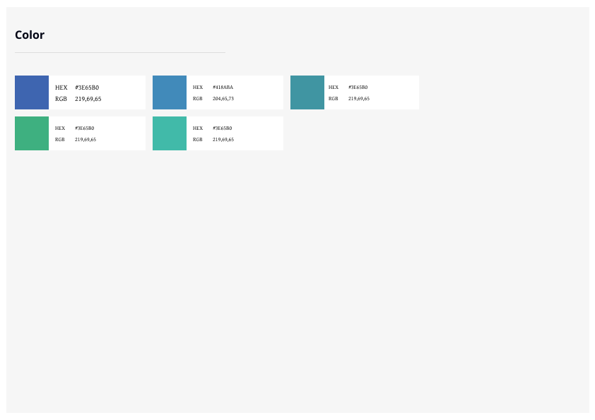
At this point, the logo was still a black/white vector. I communicated to the project manager that I needed input on colors and branding so that I could move forward. She replied over email that there is a brand color the client would like to use, but that they are open to suggestions about the color palette. Using this key color, I used Adobe Color to create a color palette. Since I wasn’t sure what the client would like, I provided them with three potential color schemes. The client preferred the analogous color scheme. The cool green and blue colors create a sense of calm and tranquility.
Logo


Once the User Testing was complete, I began to refine the logo and clean up the sizing or other dimensions so that it had a professional level finish. To do this, I created an arbitrary set of rules so that the logo could scale to any size.
Typography
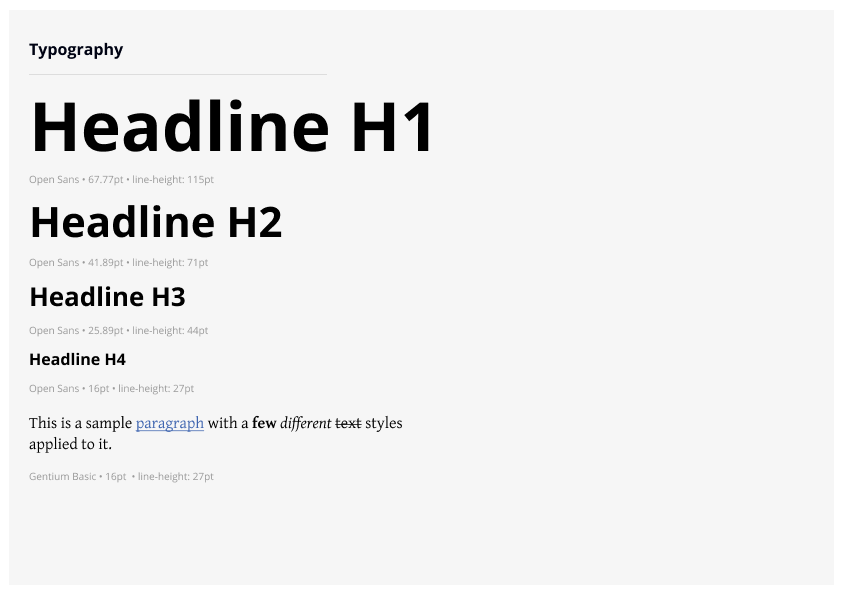
In a previous conversation, the client noted that they liked fonts that looked “sturdy”. Sturdy is a bit of a magic word, but in this context the significance was clear. Another constraint was restrictions around typefaces and fonts. I used fonts from either Google Fonts or Adobe Typekit so that there were no extra costs to the client.
User Interface


To help with implementation, I created a design system with commonly used user interface components. These components included buttons, forms, and tags. Since this project is actively being developed, the needs of the style guide are expected to change over time and I anticipate adding new elements as the core features of the platform are being developed.
Deliver
Style Guide
I created a style guide and process book so that John and Dana could communicate the branding to their partners at Healing Local.
Challenges
During this project, I experienced a few challenges along the way. The first challenge was that I wasn’t sure if there was funding available to conduct usability testing. I wanted to deliver the best logo possible, so I went ahead and paid for the testing anyways. Once I had the results of the test, our client saw the value of the information and I was refunded the money that I paid out of pocket.


