Play Store: Magical Field Notes
Client: Modern Masters
Platforms: React Native, WordPress
Tools: Google Drive, Draw.io, Figma
Processes: Proto-Personas, Mood Board, Story Mapping, Visual Design, Prototyping
Team: Nathan Nash, Dana Harvey, John Lund
Summary
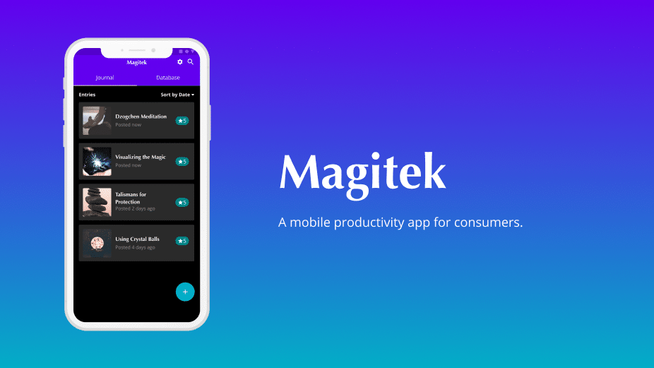
Magitek is a React Native App powered by WordPress. It is a grimoire or, a book of spells, and a journaling app for those who practice magic. My role was to design the user interface for the front-end and to create an interactive prototype. I collaborated with another UX designer and a developer to launch this project.
Discover
Proto-Personas
After the design brief, I began to brainstorm. I used word-associations as proto-personas. The purpose, to achieve a basic framework to understand the app’s users. These proto-personas, look at three types of users’ spiritualists, seekers, and materialists. Spiritual people already believe in magic. Seekers could lean either direction. Materialists don’t believe in magic at all. Using these attributes as the frame, I drew parallels between each type of user. This is a very useful way, to empathize with the world-view or “lens” of an individual.
Mood-board

With the help of Google Images, I gathered references to create a mood board. To build on the theme of “magic”, I searched for specific keywords. The keywords were magic, magicians’ tools, spells, and spell ingredients. After gathering reference images, I assembled them into a graphic collage. The purpose of this collage was to inspire the design direction of the app.
Define
Color Palette

My favorite image from the mood-board is a picture of abstract multicolored smoke. Often times in movies you’ll see the same colors used to represent magic green, blue and purple. Using that image as inspiration, I created a color palette in order to create a theme for the app. I took care to ensure that the colors worked within Material Design’s color system.
Story Mapping

I did story mapping to achieve an understanding of what a “version 1.0” would look like. This exercise was helpful because it allowed me to think about the features first. This is key because at the start of the design process ideas flow in a natural manner. Taking a step back to look at the features allowed me to view the project in a more holistic way.
User Flows
I created user flows in order to understand the navigation of the app. One of the things that I enjoy the most about user-flows, is that they are so much more fluid than wire-frames. User-flows describe what’s required of the user. Yet they do not constrain the way the app looks. My biggest takeaway was that lateral navigation made the most sense for this app.
Lateral navigation refers to moving between screens on the same level of the hierarchy. While looking at the user-flows I was able to discern that the differences “create a spell” and “create journal” are nominal. This tells me, that those experiences should mirror each-other.
Develop
High-Fidelity Prototype

When I started working on this project, the wireframes were already complete. I reviewed them with the designer who made them so that we were on the same page. The creator of the original wireframes gave me a lot of freedom to refactor things as I saw fit.
The first decision that I made was to switch from iOS to Material Design by eliminating the tab bar. With the tab bar gone, I replaced it with the app bar. In the app bar, actions are contextual and are only present when needed. This pattern also places important actions in a prominent position. After implementing the app bar, I used tabs to create a sense of lateral navigation.
Challenges
It’s rare that a design problem gets solved without a few hiccups along the way. Here’s what I struggled with during this project.
One question that I faced was, “How should I handle the creation of journal and database entries”? I reviewed the current state of Chatbot UX to determine if it was a good fit. I decided against it. This is because of one, the length of the form and two the scope of the user input required. While building out the wireframes for the Chatbot UX it required way, way more screens than a typical web form.
Another design decision, was how do I request information about “materials required” and “correspondences”? This question was simpler to answer than the other. Some spells require materials such as candles, crystals or herbs. Correspondences are even more complicated. There are entire books on the subject. The wireframes had a tree list of checkbox options to capture this information. In the end, a free form text field was the simplest experience for the user.
Finally, the biggest challenge was simplifying the original form. There were a lot of questions, and user input requested. I chose to use APIs to create data based on other inputs. An example of this is the phase of the moon at the time of performing a spell. This isn’t something everyone is aware of. So, I found an API that could create that data point for us by using the date and time entered by the user.


